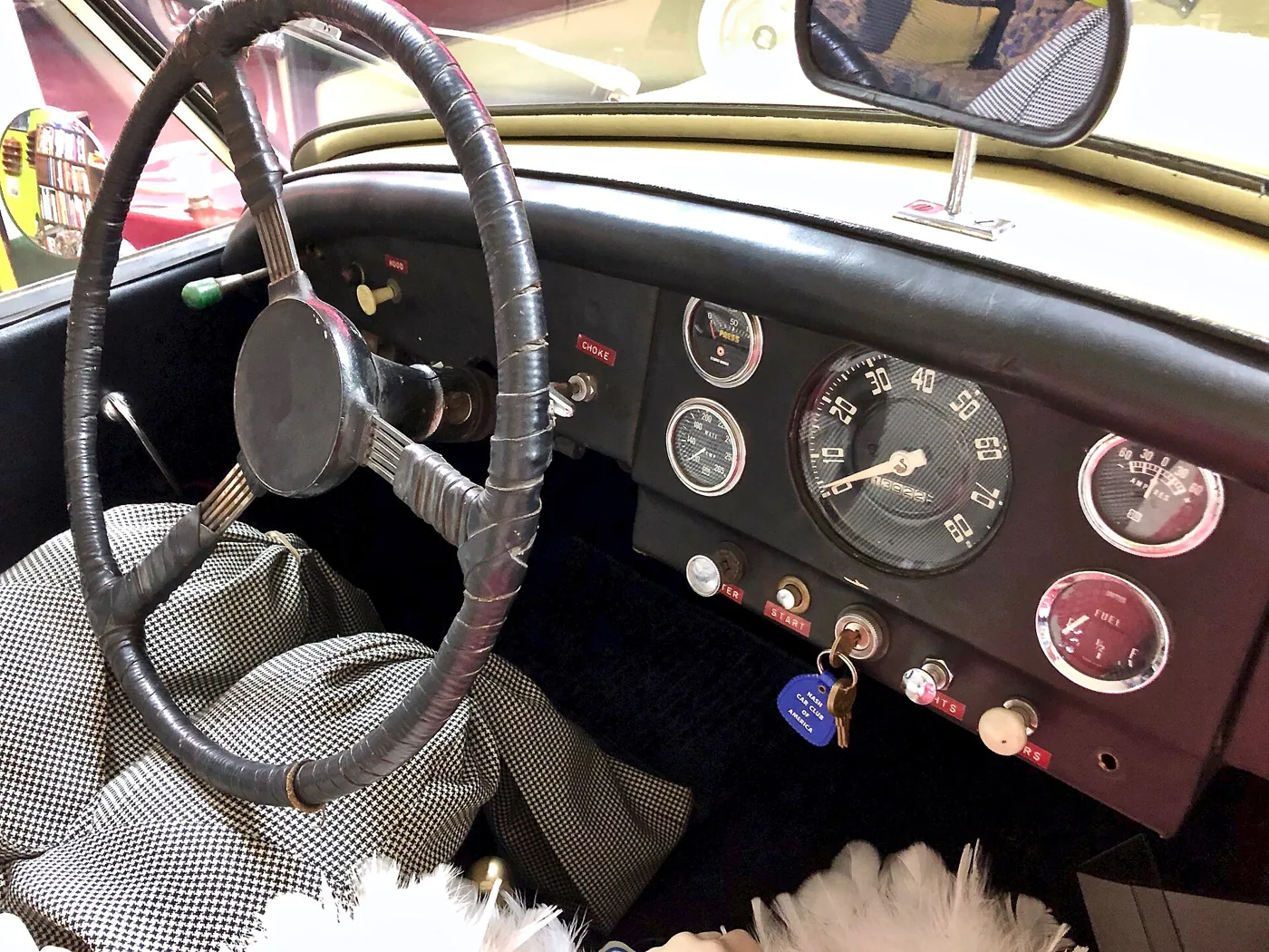
A dashboard can look beautifully clean in a photograph and still require too much thought in daily use. It can also contain physical controls that are poorly arranged or difficult to distinguish. The meaningful debate is not a loyalty contest between old and new interfaces. It is about how clearly a car communicates what the driver needs to do.
- Evaluate frequent and urgent tasks while the car is parked.
- Look for predictable placement and clear feedback.
- Judge the interface in the full seating and visibility context.
Begin with the task, not the surface
Consider common actions: changing cabin temperature, clearing a misted windscreen, selecting a destination, or adjusting audio. Each has a different urgency and frequency. A well-designed interface respects those differences. Essential controls should be easy to locate and understand, while less frequent settings can reasonably live deeper in a menu used when parked.
A familiar control can reduce the effort of learning a new car, but familiarity alone is not a complete design standard. Labels, feedback, consistency, and physical reach also matter. The useful evaluation asks whether the interface makes the next action obvious, confirms the result clearly, and avoids surprising changes in where a function can be found.
Value predictability over visual drama
An interface may impress at handover through animation, unusual shapes, or a large display. Those qualities do not establish how it will feel after hundreds of ordinary journeys. Predictable behavior often becomes more valuable with use. A control that responds consistently can disappear into a routine, leaving more attention available for the road.
NHTSA identifies interacting with entertainment and navigation systems as potential sources of distraction. That supports a practical ownership habit: learn and configure the system while parked. It does not prove that every physical switch is safe or every screen is unsafe. Design and use both contribute to how much attention an interaction demands.
Evaluate the whole cabin
The dashboard does not operate in isolation. Seat position, steering-wheel adjustment, daylight reflections, and the driver's reach can change how usable a control feels. Look at the car in realistic conditions rather than judging only a studio image. Try ordinary tasks while stationary and notice where you hesitate or need to lean.
Passengers also belong in the assessment. Can they adjust their own environment without interrupting the driver? Is useful storage reachable without blocking controls? A cabin succeeds through many small relationships. The most persuasive design is often the one whose practical logic remains clear after its materials and graphics stop being novel.
Keep room for different solutions
There is no need for every car to share one visual language. Some owners prefer a restrained display, others appreciate configurable information. The common requirement is that the system serves the journey and makes limitations clear. Personal preference should be separated from claims about universal superiority.
Manufacturers' design statements, such as Mazda's discussion of cabin functionality, offer a view of intended priorities. Owners should compare those intentions with the tasks they actually perform. The strongest case for understandable controls is modest and practical: a car should not require repeated negotiation to accomplish an ordinary action that the driver already knows they want to complete.
Sources & further reading
These references provide background for this analysis. Product details, regional rules and market conditions can change; check the original source for its scope and date.
Something needs a closer look? Send a correction.